|
|
Post by jeffolie on Oct 17, 2012 16:57:01 GMT -6
Peak P/E? is a fundamental timing tool? Earnings are fundamental. In the technical trading world a fundamental view often gets ignored...too slow or too unreliable Often earnings beat expectations because that is expected resulting accounting and financial manipulations to 'make it happen'. Trailing p/e's and dividends are a little more reliable but subject to revisions making them not very timely for short term market timers. Algorithms in HFT's absorb so much information and nuances from data faster than traders can blink their eyes. Long term low p/e's are associated with market lows while high p/e's are associated with market tops. This become very difficult because of the accounting manipulations to use to pick tops and bottoms. =================================== Peak P/E? 10/17/2012 There is little doubt that asset prices have responded to Central Bank promises and actions. Even as bottom-up fundamentals are fading, top-down index 'nominal prices' rise on the back of magical multiple expansion - which is defended from on high by sell-side strategists the world over on the back of 'recovery' is just around the corner. The trouble is there's a limit and it seems - from QE2 and LTRO - that we are rapidly approaching that limit; and with earnings outlooks being revised lower, perhaps we are at peak P/E for this cycle of QE? Each line is the normalized gain in P/E from the onset of expectations for Central Bank largesse: (QE2 - green; LTRO - red; QEtc. - Orange)  www.zerohedge.com/sites/default/files/images/user3303/imageroot/2012/10/20121017_PEQE.png www.zerohedge.com/sites/default/files/images/user3303/imageroot/2012/10/20121017_PEQE.png Adapted from Bloomberg Chart of the Day |
|
|
|
Post by jeffolie on Oct 18, 2012 16:25:59 GMT -6
my jeffolie view: If the pattern repeats, then another short term rise appears to be coming. On the other hand various worrying issues cloud the future: lower earning in techs, fiscal cliff [today Obama threatened to veto any settlement w/o taxes on the rich], EU disappointment, Israel v Iran; a cliche applies: stocks climb a wall of worry, plus sell the good news.; bottom line-- stocks most likely will rally in Nov, Dec to S&P index 1565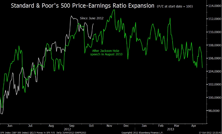 www.ritholtz.com/blog/wp-content/uploads/2012/10/chart11.png www.ritholtz.com/blog/wp-content/uploads/2012/10/chart11.png=================== " ... Over the years, I have described secular bull and bear markets as long periods of earnings multiple expansion and compression (respectively).
What is the impact of the Fed’s QE on the P/E compression that began when the market peaked in March 2000 or October 2007?
Dave Wilson of Bloomberg points us to Gina Martin Adams of Wells Fargo & Co. for the answer. Adams notes the parallels between QE2 and QE3 in terms of Standard & Poor’s 500 Index’s price-earnings ratio. Assuming the same patterns holds, current P/E expansion might be about a month or so away from peaking.
Adams suggest that the S&P 500’s higher valuation makes an argument for buying defensive stocks those companies least affected by economic swings. She likes food, beverages and consumer staples, along with health care.www.ritholtz.com/blog/2012/10/chart-of-the-day-2/
|
|
|
|
Post by jeffolie on Oct 22, 2012 16:26:10 GMT -6
|
|
|
|
Post by jeffolie on Oct 27, 2012 12:00:43 GMT -6
|
|
|
|
Post by jeffolie on Jan 17, 2013 18:27:16 GMT -6
 www.ritholtz.com/blog/wp-content/uploads/2013/01/TRAILING.jpg www.ritholtz.com/blog/wp-content/uploads/2013/01/TRAILING.jpgS&P 500 and Sector P/E Ratio Charts January 16, 2013 Below is an updated look at P/E ratio (trailing 12-month) charts for the S&P 500 and its ten sectors. As shown, the S&P 500's P/E ratio has creeped up to 14.80 during the current rally, but it's still below the high it reached back in September when the S&P 500 hit its prior bull market high. Earnings reports will be flooding the market over the next few weeks, so we could see some swings in the S&P's P/E ratio depending on how strong or weak earnings are for the largest stocks in the US. P/E ratios for most sectors have also increased throughout this rally. Telecom has the highest P/E ratio at 21.98, followed by Consumer Discretionary and Consumer Staples. Interestingly, two of the three sectors with the highest P/Es are defensive sectors (Telecom and Consumer Staples). The Utilities sector also has a high valuation for a defensive sector at 15.44. Sectors like Financials, Industrials, Energy and even Technology have more attractive valuations than Utilities. While Technology is typically thought of as a high-risk growth sector, it actually has the fifth lowest P/E ratio in the S&P 500. www.bespokeinvest.com/thinkbig/2013/1/16/sp-500-and-sector-pe-ratio-charts.htmlwww.ritholtz.com/blog/ |
|
|
|
Post by jeffolie on Feb 27, 2013 17:11:06 GMT -6
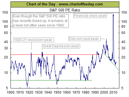
 www.ritholtz.com/blog/wp-content/uploads/2013/02/chart-of-the-day-2.jpg www.ritholtz.com/blog/wp-content/uploads/2013/02/chart-of-the-day-2.jpgChart of the Day Today's chart illustrates the price to earnings ratio (PE ratio) from 1900 to present. Generally speaking, when the PE ratio is high, stocks are considered to be expensive. When the PE ratio is low, stocks are considered to be inexpensive. From 1900 into the mid-1990s, the PE ratio tended to peak in the low to mid-20s (red line) and trough somewhere around seven (green line). The price investors were willing to pay for a dollar of earnings increased during the dot-com boom (late 1990s), surged even higher during the dot-com bust (early 2000s), and spiked to extraordinary levels during the financial crisis (late 2000s). Since the early 2000s, the PE ratio has been trending lower with the very significant but relatively brief exception that was the financial crisis. More recently, the PE ratio has moved slightly higher. It is worth noting, however, that even with this recent uptick, the PE ratio still remains at a level not often seen since 1990. www.chartoftheday.com/20130227.htm?T |
|
|
|
Post by jeffolie on Mar 7, 2013 13:54:59 GMT -6
P/E's ? price to forward earnings ? ================================ Buy-Or-Sell - The Only Chart You Need 03/07/2013 Morgan Stanley Earlier we noted the relative un-cheapness of the US equity market and its elevated expectations that seem just a little excessively hope-driven relative to any historical precedent. However, the decision still remains, do you buy moar here at the highs (as it's different this time) or cover/protect? The following chart, from Morgan Stanley, offers some insight into just how broadly 'expensive' this market is. Each time more than 45% of stocks have reached these valuation levels in the past 13 years, the market has decided enough is enough and shaken loose. But as we keep being told, it is different this time.  www.zerohedge.com/sites/default/files/images/user3303/imageroot/2013/03/20130307_ms4.jpg www.zerohedge.com/sites/default/files/images/user3303/imageroot/2013/03/20130307_ms4.jpg Chart: Morgan Stanley www.zerohedge.com/news/2013-03-07/buy-or-sell-only-chart-you-need
|
|
|
|
Post by jeffolie on Mar 7, 2013 14:19:12 GMT -6
P/E's ? price to forward earnings ? ================================ Buy-Or-Sell - The Only Chart You Need 03/07/2013 Morgan Stanley Earlier we noted the relative un-cheapness of the US equity market and its elevated expectations that seem just a little excessively hope-driven relative to any historical precedent. However, the decision still remains, do you buy moar here at the highs (as it's different this time) or cover/protect? The following chart, from Morgan Stanley, offers some insight into just how broadly 'expensive' this market is. Each time more than 45% of stocks have reached these valuation levels in the past 13 years, the market has decided enough is enough and shaken loose. But as we keep being told, it is different this time. www.zerohedge.com/sites/default/files/images/user3303/imageroot/2013/03/20130307_ms4.jpg Chart: Morgan Stanley www.zerohedge.com/news/2013-03-07/buy-or-sell-only-chart-you-need Are Stocks Cheap? 03/07/2013 Morgan Stanley Each and every day, we are bombarded by a never-ending series of asset-gatherers whose sole aim in life is to convince investors to put more money to work. Whether it is because 'we are climbing a wall of worry', whether 'long-term' equity investors always do well, whether the 'cash on the sidelines' is coming out (note - remember there is a seller for every buyer and a buyer for every seller); the most frequently proposed reason for buying stocks is 'because they are cheap'. No matter where they are trading - high or low - they are cheap. Well, in an attempt to suggest otherwise - or at least provide fact rather than accepted wisdom, the following two charts from Morgan Stanley's Adam Parker provide the reality that, in fact, stocks are not cheap - and given where rates are, they are in fact expensive. Empirical fact not fiction. S&P 1500 - Price to Forward Earnings at its long-term median - and highs post-crisis.  www.zerohedge.com/sites/default/files/images/user3303/imageroot/2013/03/20130307_MS1.jpg www.zerohedge.com/sites/default/files/images/user3303/imageroot/2013/03/20130307_MS1.jpg and give how low real rates are, P/Es shoould be considerably lower...  www.zerohedge.com/sites/default/files/images/user3303/imageroot/2013/03/20130307_MS2_0.jpg www.zerohedge.com/sites/default/files/images/user3303/imageroot/2013/03/20130307_MS2_0.jpg and just what is the market expecting? Huge margin expansion...  www.zerohedge.com/sites/default/files/images/user3303/imageroot/2013/03/20130307_MS3.jpg www.zerohedge.com/sites/default/files/images/user3303/imageroot/2013/03/20130307_MS3.jpgAs he notes, it seems corporate health is anti-correlated to economic health. Charts: Morgan Stanley www.zerohedge.com/news/2013-03-07/are-stocks-cheap |
|